

Craft
Montenegro airports website redesign: Podgorica and Tivat on one site
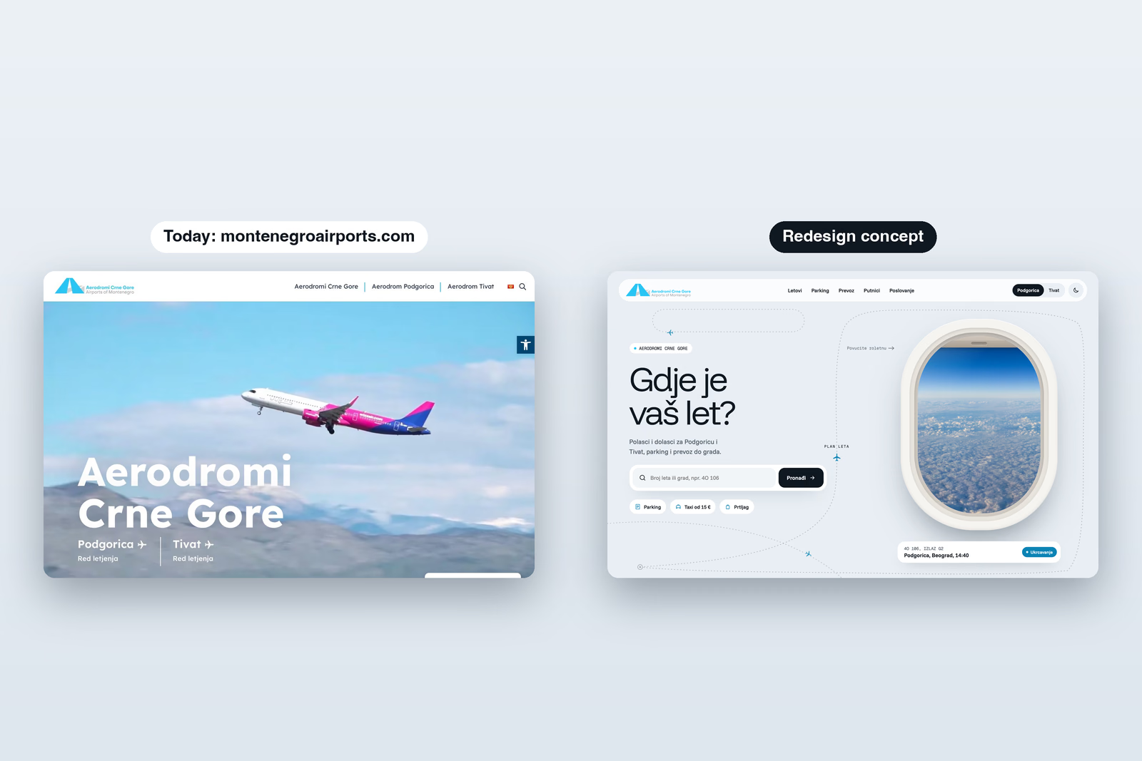
This is an unofficial concept. Aerodromi Crne Gore did not commission it, and Rhomn is not affiliated with Aerodromi Crne Gore. We redesigned montenegroairports.com, the website for Montenegro's two international airports, Podgorica and Tivat, to see what it looks like when it starts from the question almost every visitor arrives with: where is my flight?
Start from the flight
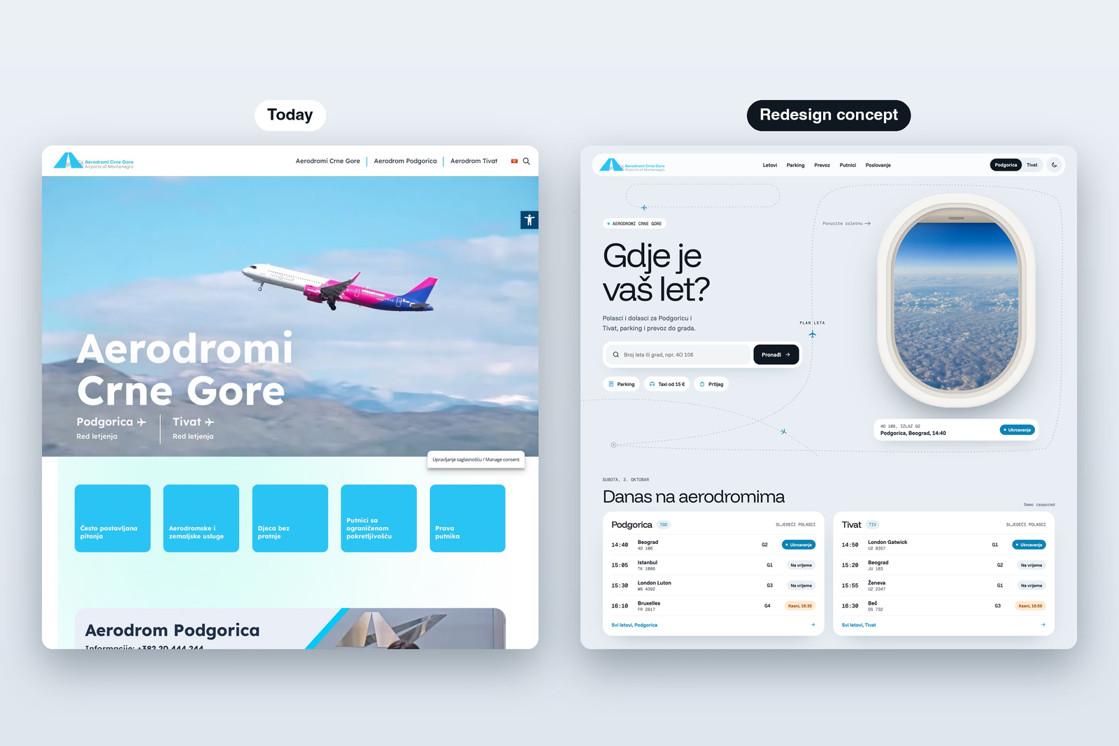
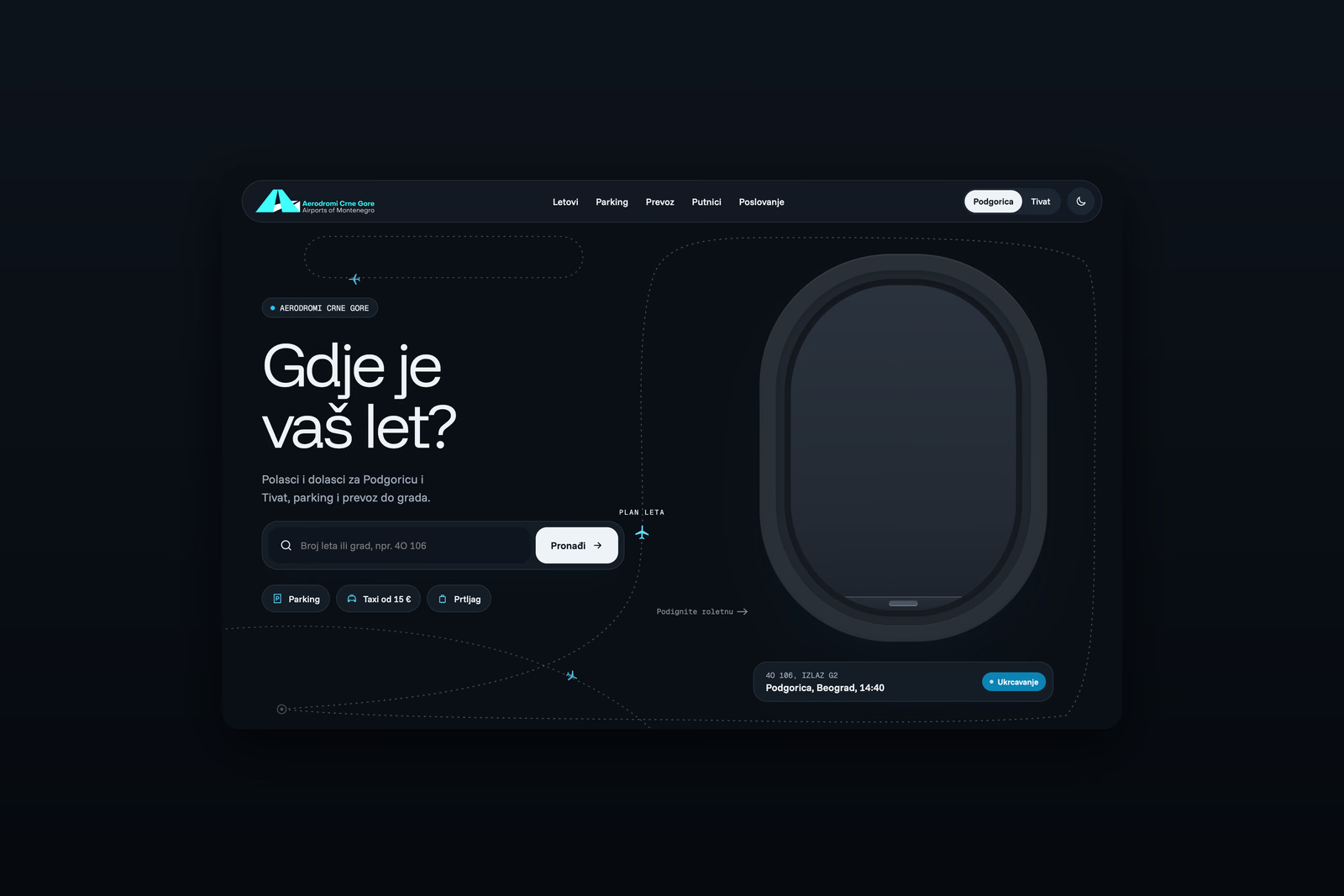
Today the homepage opens on a large photo of a plane, the company name and a row of tiles: frequently asked questions, airport services, unaccompanied children, reduced mobility and passenger rights. The timetable sits behind a separate link for each airport. The redesign puts the question first. The headline asks Gdje je vaš let?, one search takes a flight number or a city for both airports, and parking, transfers and baggage rules sit right under it as one-tap shortcuts.
Pull the shade, the site goes dark
The hero is an aeroplane window with clouds drifting past. Drag the shade down and the whole site follows it into night mode, from the sky outside to every card on the page. Lift it and the day comes back. It is the theme switch, made into the one thing everyone remembers from a flight, and it is the reason people will try the site twice.
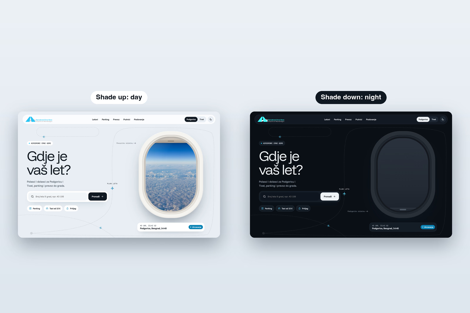
You can try it yourself: the case study has the homepage live, shade and all.
Departures and arrivals on one screen
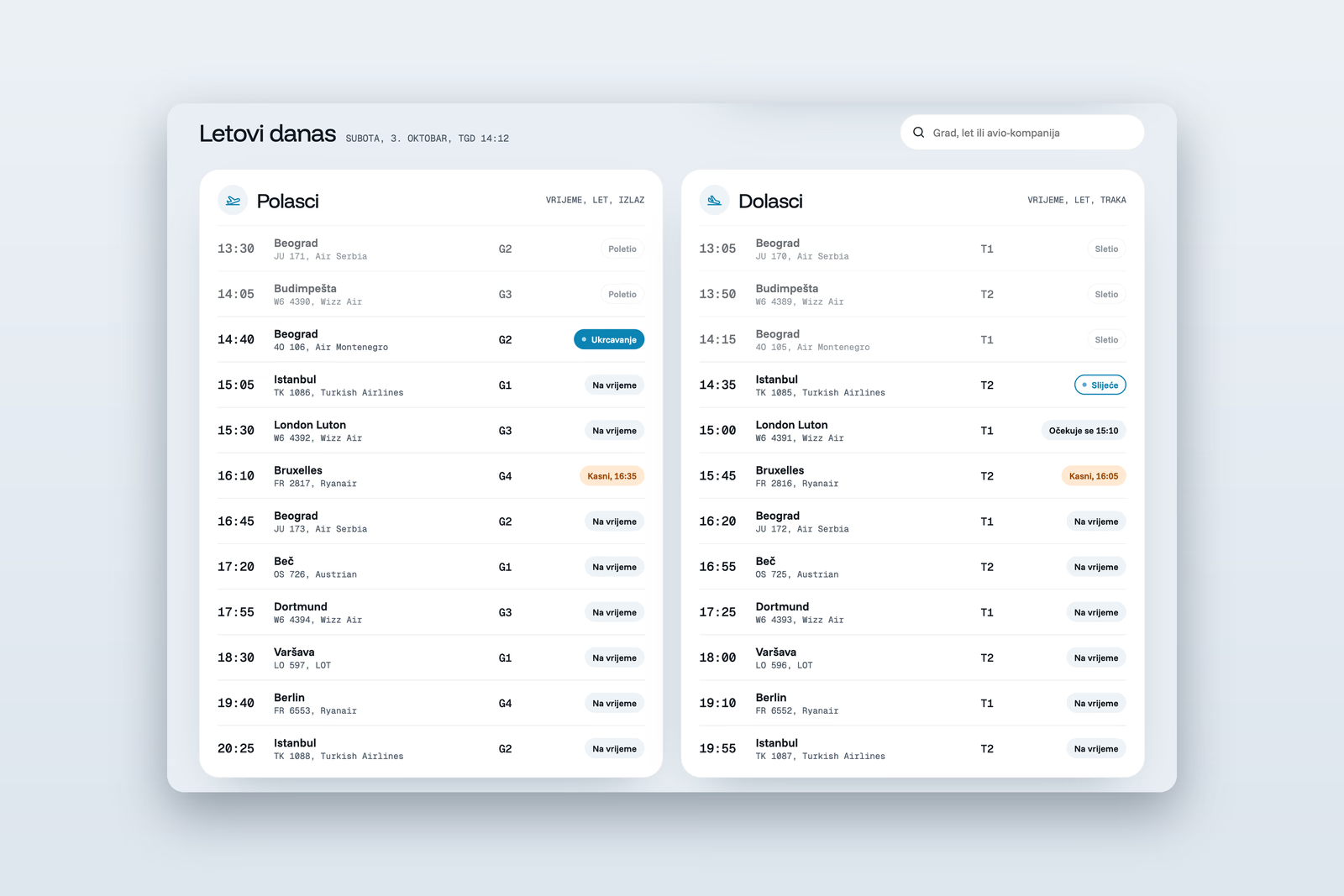
Each airport gets one board with departures on the left and arrivals on the right. Every flight shows its time, airline, gate or baggage belt, and a status that follows it from boarding to landing: on time, boarding, delayed with the new time, landed. Times are set in Geist Mono, so a column of departures reads like the board in the terminal.
Two airports, one site
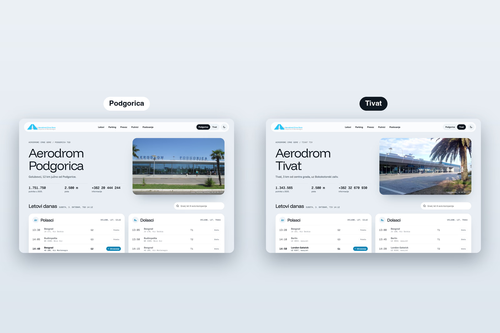
Podgorica and Tivat share one layout, and you switch between them from the top bar. Each page opens with the airport's own photo, its distance from the town and its information number, then today's flights for that airport. A traveller who flies out of one and back into the other never has to learn a second site.
A look built from flying
Funnel Display sets the headlines, Funnel Sans the interface and Geist Mono every flight number, gate and time. A dotted flight path runs behind the homepage with small planes moving along it, and the clouds in the window keep drifting. The point is a site that feels like the trip it serves, not a brochure about an airport company.
Airlines are real; flight numbers and times are a demo. The project is in the Aerodromi Crne Gore redesign case study, and the kind of work behind it is on the web design page.