
Craft
Redesigning EPCG: a power bill you can pay without an account
This is an unofficial concept. EPCG did not commission it, and Rhomn is not affiliated with EPCG. We redesigned the website, the customer portal and the app of Montenegro's national power company to see what a public utility looks like when it starts from the one thing people come to do.
Start from the bill
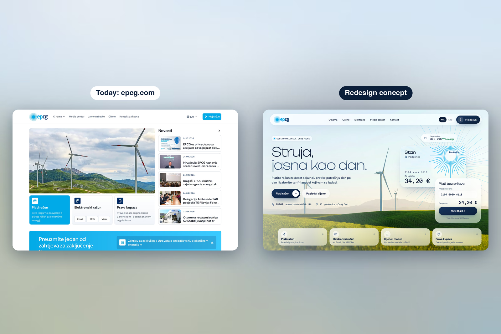
Most people open epcg.com to pay. Today the homepage leads with news, a large photo and a row of service tiles, and paying means finding the right one. The new homepage pays straight away: enter the customer number, see the amount, pay by card. No account, no login. Tariffs, power plants and the news are still there, one tap away, but they no longer stand between a household and its bill.
The logo becomes the chart
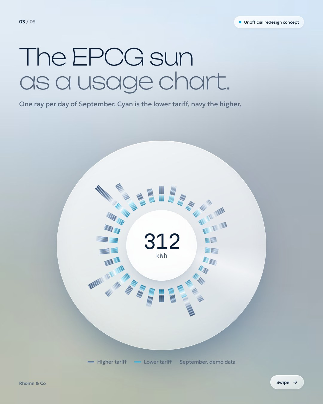
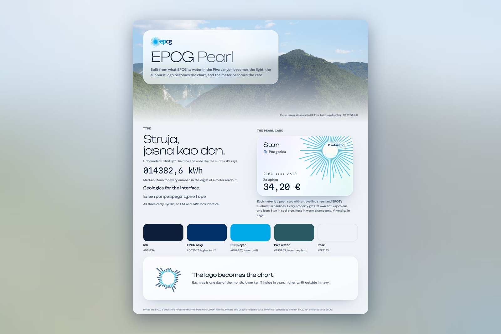
The look is built from what EPCG already is rather than from a template. Water in the Piva canyon becomes the light behind the glass. Each meter becomes a pearl card with its own tint, so a flat, a house and a weekend cottage are told apart at a glance. And the sunburst in the logo becomes the usage chart: one ray for each day of the month, the lower tariff inside in cyan, the higher tariff outside in navy. The brand stops being decoration and starts carrying information.
Unbounded sets the headlines, Martian Mono every number, so amounts read like a meter, and Geologica the interface. All three carry Cyrillic, so a Latin page and a Cyrillic page look the same.
One overview for every meter
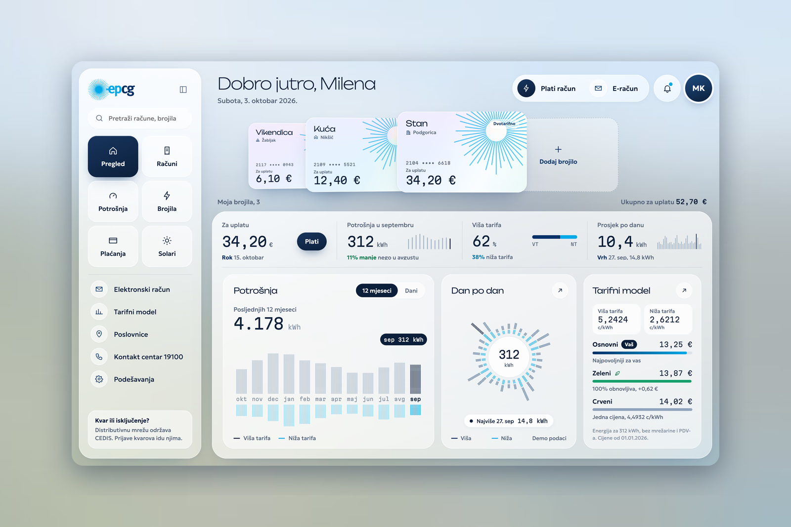
The customer portal puts every meter on one screen: the amount due, the last twelve months, the month day by day, and the tariff models side by side. Bills, usage, meters and payments each get their own page, one click from the overview. Outages point to CEDIS, the company that runs the grid, because that is where a fault report actually goes.
Prices as an answer, not a table
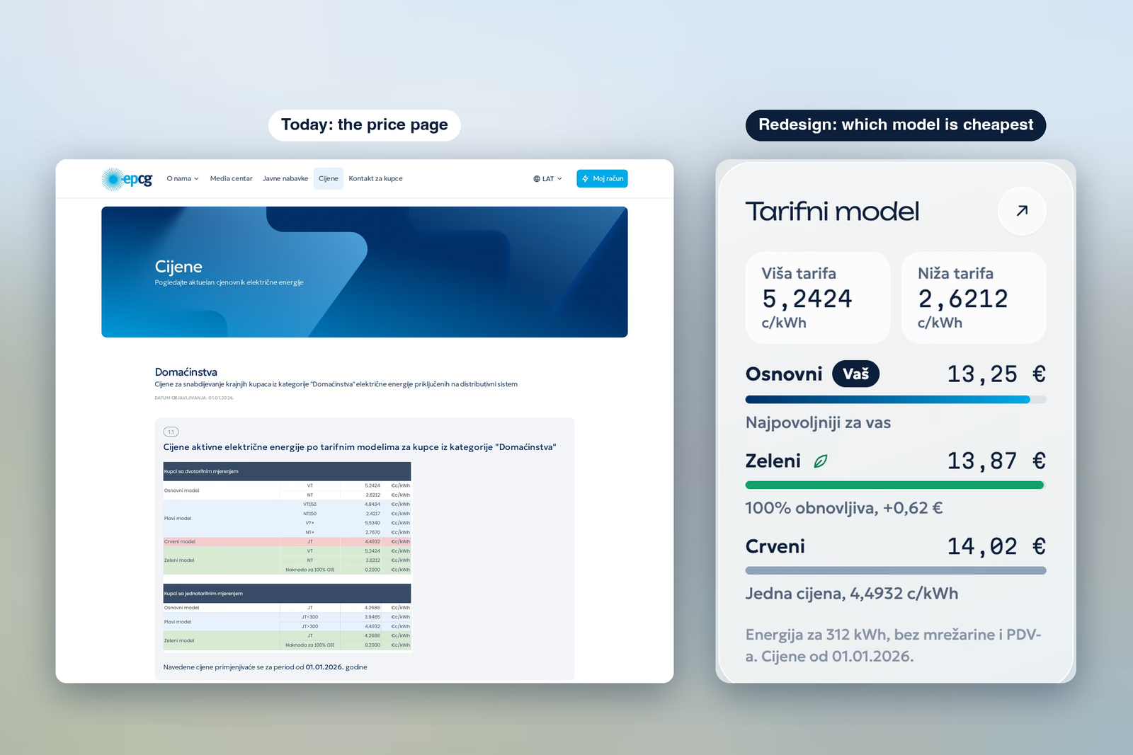
Today's price page is a set of tariff tables, and working out which model is cheaper for a household is left to the reader. The redesign answers that question directly: EPCG's published household tariffs from 1 January 2026, priced for a month of 312 kWh on every model, with the cheapest one marked.
The same cards in the app
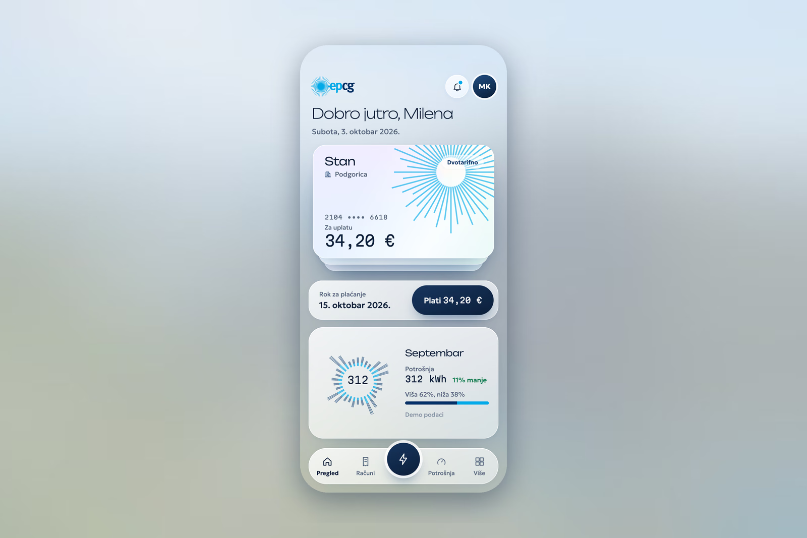
The app carries the same pearl cards and the same sun into a phone: the meter, the amount due with one button to pay, and the month's usage at a glance.
Prices are real; names, meters and usage are demo data. The project is in the EPCG redesign case study, and the kind of work behind it, websites, portals and apps built as one system, is on the Product & SaaS page.